Viewing large CSV files interactively with VisualGDB
VisualGDB Custom Edition and higher allows plotting large CSV files (1M+ lines) and exploring them interactively using the visualization GUI from Live Watch. You can plot any CSV file by selecting File->Open->Open a CSV File as a graph: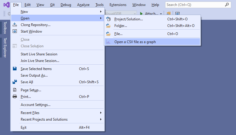 The first line of the CSV file should contain the column labels, and the rest of it should use comma to separate values, e.g.:
Time,Sin,Cos 0,0,1 0.001,0.000999999833333342,0.999999500000042 0.002,0.00199999866666693,0.999998000000667 0.003,0.00299999550000203,0.999995500003375 |
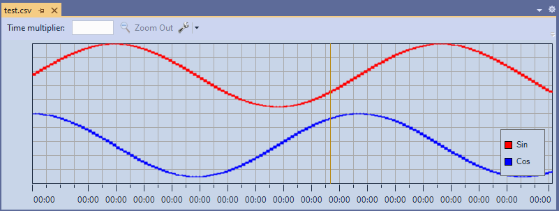
The graphs will be displayed in regular Visual Studio document tabs, so you can dock them arbitrarily, or open multiple tabs at once: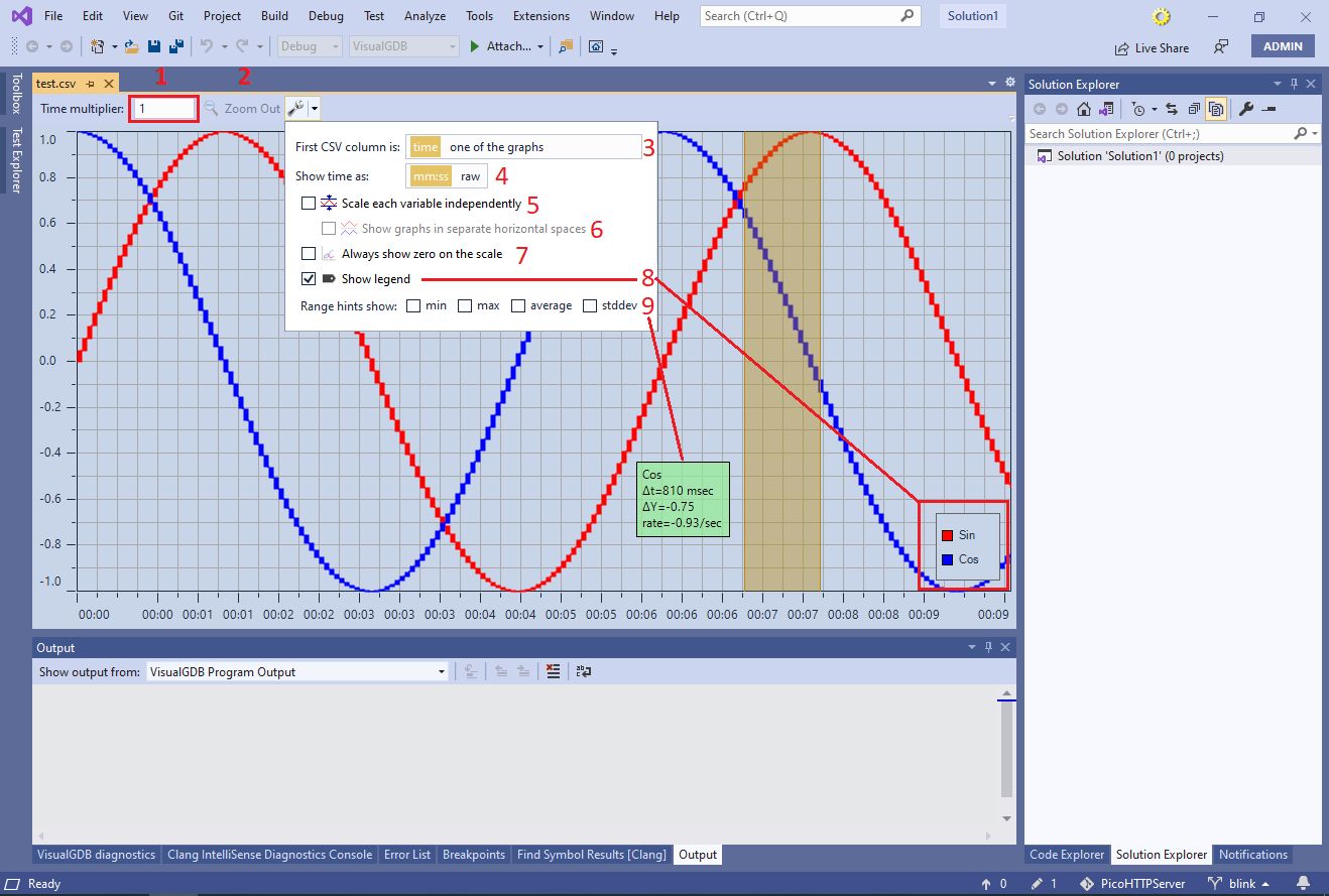
You can zoom the graph in and out (X axis only) at any time using the mouse wheel. Alternatively, drag the mouse while holding ‘Shift’ to pan the view left or right. Click and drag to select a range on the graph and use the context menu to zoom into it.
The graph view provides the following controls:
- Time multiplier allows customizing the time values displayed throughout the GUI. Normally, VisualGDB expects the time column to specify seconds (e.g. 0, 1 or 0.123) or time labels (e.g. 01:00 or 00:01.0000) and will use the values from it to display the labels and compute the rate of value change. If the original CSV file specifies the time in another unit, you can set the multiplier accordingly, e.g.:
Time unit in original file Multiplier Seconds 1 Milliseconds 0.0001 or 1e-3 Minutes 60 - The Zoom Out button provides an easy way to show the entire graph if you had previously zoomed into a region of it.
- The First CSV Column setting controls whether the first column in the CSV file contains time or one of the values. In the latter case, the time will be computed from the CSV line number using the multiplier (1).
- The Show Time option controls whether the time is shown using the minutes:seconds format vs. seconds with fractional part.
- If the columns in the CSV file have wildly different ranges (e.g. 0..1 vs -1000..1000) plotting them on the same graph may not be very useful, as the smaller variable will appear almost constant. The “Scale each variable independently” option takes care of this by scaling each graph between its minimum and maximum value independently, overlaying them over each other.
- If scaling the graphs independently makes it harder to read them due to the overlaying, you can configure VisualGDB to show graphs in separate horizontal spaces:
- An option to show zero on the scale makes it easier to understand the scale if both minimum and maximum values are above or below zero.
- The show legend option controls the visibility of the legend. You can use the mouse to drag the legend around the graph, or click on individual graphs in the legend to temporarily hide them.
- Range hints allow showing various information about a graph when selecting a range by clicking and dragging the mouse.
In order to speed up the rendering of huge graphs, VisualGDB automatically condenses them. If the graph appears blocky, it means that the value in that region changes faster than the current zoom ratio can show, so VisualGDB is showing the maximum and minimum values as a rectangle: 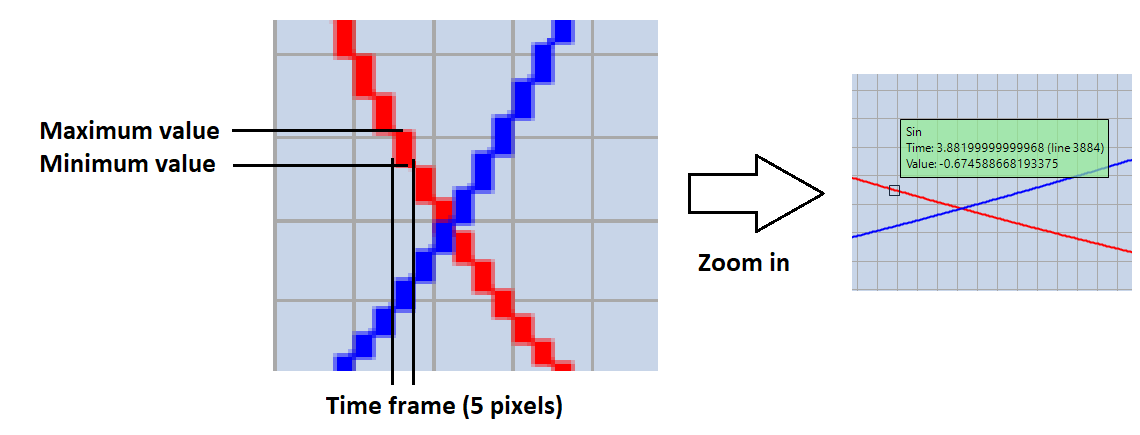 Zooming into the area either via the mouse wheel or by selecting a range and using the context menu will show the more precise values. You can hover the mouse over the graph to see the exact value from the CSV file (including the line number).